Ice Cream Shop Neon Signs for Playful Customer Spaces

Ice cream venues naturally support bright color, simple graphics and lighthearted language. A neon sign can identify the shop, frame the service counter or create a photo point that customers notice while choosing flavors and waiting for orders.

Cones, scoops and dessert words provide immediate visual context. For a long-term store feature, a custom name or brand phrase can connect the interior with cups, menus and social content more effectively than a generic decoration.

Where does an ice cream neon sign work best?

Windows can use simple silhouettes that remain clear from outside. Behind the counter, make sure the sign is not hidden by menu boards or equipment. Photo walls need enough free width for customers to stand beside or below the design without covering it.

Which colors suit an ice cream shop?

Brand colors are the first reference, followed by contrast with tile, painted walls and menu graphics. Pastels can support a soft, nostalgic interior, while saturated colors create a more energetic result. Limit the palette when the surrounding space already contains many flavor colors.

What wording will customers understand quickly?

A shop name, short dessert phrase or familiar invitation works at a glance. Avoid long copy near the order point, where menus require attention. A separate seating or photo area can support more playful language because customers have time to read and interact with it.

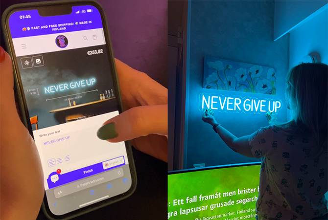
Use a ready-made cone or scoop motif for instant category recognition, or create a custom shop message in the design tool. Check the final composition against the full store palette so the sign has presence without overwhelming the products.

Căutați ceva mai personal?


Utilizați instrumentul de design de mai jos pentru a vă crea liber semnul neon personalizat!!! Alege-ți textul, alege dintr-o varietate de fonturi și culori, ajustează dimensiunea și vezi cum creația ta prinde viață în timp real.