Quote Neon Signs: Choosing Words That Work on a Wall

A quote neon sign asks language to function as both message and shape. Short wording gives each letter more room, stays readable from farther away and is easier to place above furniture or within a backdrop. Longer text can work, but usually needs a wider format and more careful line breaks.

This collection includes ready-made phrases for homes, studios and customer-facing spaces. Custom text is the better route when the meaning depends on an original saying, family expression, business line or message tied to a particular person.

How long should a neon quote be?

A few words or one concise sentence is easier to design and read than a paragraph. Remove any word that does not add meaning, then preview the complete phrase at the intended width. If several lines are needed, keep the break points natural.

Which font makes a quote readable?

Script fonts can give personal or expressive wording more character, while block styles provide clear structure. The best choice depends on the actual letter combinations, not the font sample alone. Review the full sentence, including punctuation and repeated letters.

Can any quote be used?

Original wording is the clearest option. Lyrics, book passages, film lines and attributed quotations may be protected, especially when used commercially. Confirm that you have the right to reproduce the text rather than assuming a familiar phrase is free to use.

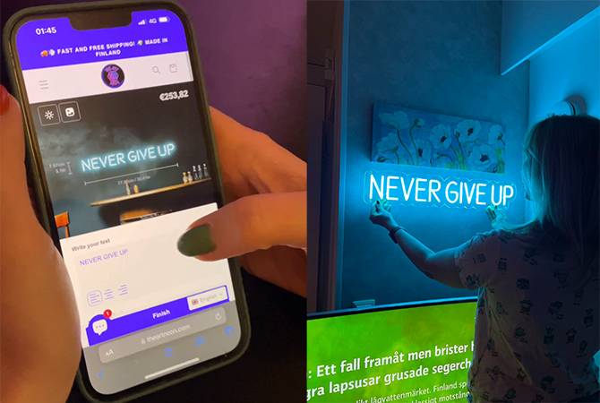
Use the online designer to test the exact message, line breaks and capitalization. Recheck every character before approval and measure the wall from the normal reading distance so the finished quote has enough space to breathe.

Ψάχνετε για κάτι πιο προσωπικό;


Χρησιμοποιήστε το παρακάτω εργαλείο σχεδιασμού για να δημιουργήσετε ελεύθερα την προσαρμοσμένη πινακίδα νέον!! Επιλέξτε το κείμενό σας, επιλέξτε από μια ποικιλία γραμματοσειρών και χρωμάτων, ρυθμίστε το μέγεθος και δείτε τη δημιουργία σας να ζωντανεύει σε πραγματικό χρόνο.